B2B Articles - Mar 10, 2014 4:05:45 PM - By Dev Team Ironpaper
Ironpaper recently transformed the face of The Quire to include a better user experience and increase a diverse author visibility in order to make the website stand out as a leading news source for the LGBT community. Since the launch of the redesign, The Quire has seen a bounce rate decrease of 32.5%, and a 22.5% increase in unique visits.
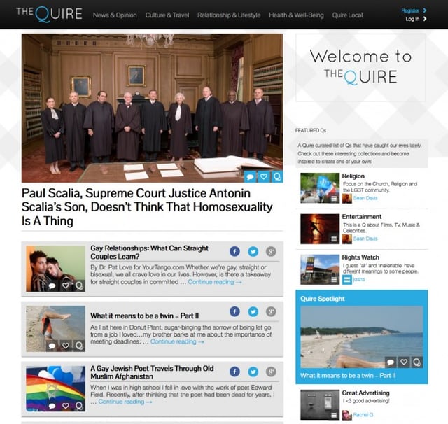
 AFTER: The Quire Homepage
A viewer can now read, respond, and navigate to every part of the website within any first-page visit, on any device. No page is a dead-end; the site transformed from being a linear bulleted format to being a completely fluid exploratory exercise in viewing news online.
When employing a gaggle of writers, they want to make sure that their name get's out there. With the new layout viewers can immediately see their favorite writer's recent post, get to all of their articles with one click, and find all of the articles from the same sub-category, all within the first glance.
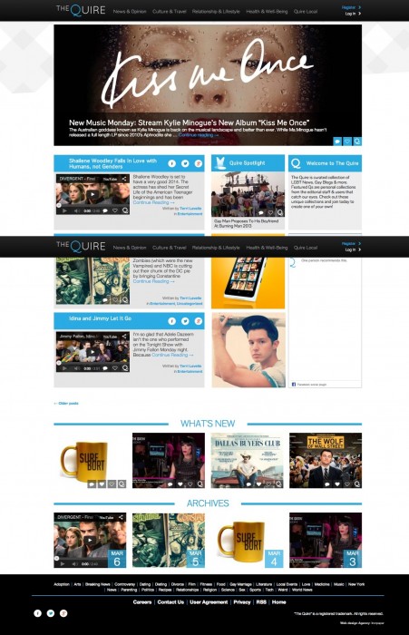
 BEFORE: Homepage Design
The site now emphasizes that it's a news source, that includes blogs, editorial pieces, quizzes, galleries, videos and more. By removing the barrier that text can become and focusing on explaining what an article could be about via imagery allows for people to actually judge this compilation by its set of covers, which builds inherent interest. Also by adding the use of iconography for things like exclusives, interviews and more, we've built in another layer to the exploration factor of the site. It's no longer about just reading, it's about experiencing.
Learn More: The Quire