B2B Articles - Jul 15, 2010 10:29:40 AM - By Ironpaper

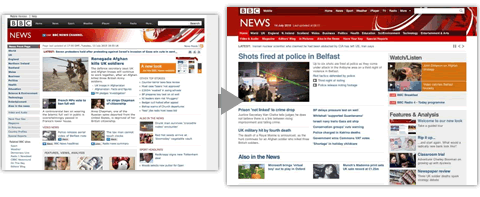
The BBC undergoes a re-design to it's website, which produces a huge outpouring of comments on the BBC editor's blog. Already the editor's blog contains 2000 comments--many of which are negative.
The new web design makes the interface cleaner and adds a lot of white space. The side navigation has been removed and the number of article related imagery has been reduced. Overall, the new design tries to reduce the overall clutter and clarify and remove distractions from the top stories. Access to social links has been improved as well.
Many of the negative responses found in the Editor's Blog are aesthetic or taste focused--although many say that the new design is too simple or difficult to use in general. For example, one reader writes "new look makes the BBC Website seem like a less sophisticated version of the CNN website."
One observation that we noted was the obvious disconnect between the homepage of BBC.co.uk and the new news landing page BBC.co.uk/news. The navigation systems are different--to the point where even the reds that are used in the theme are inconsistent.