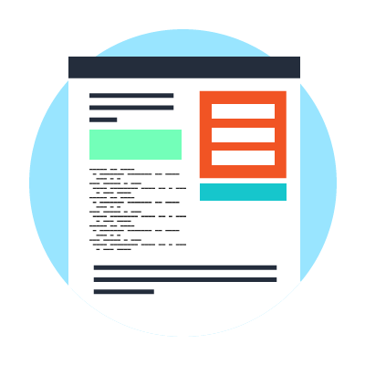
Landing pages play a crucial role in making sure your inbound marketing strategy is successful. Landing pages are the culmination of your lead generation efforts. When visitors arrive on these pages as a result of your SEO, social media, PPC advertising, and content strategies, the job of the landing page is to direct them into a more engaged action, such as filling out a form or clicking a call-to-action. In that way, your visitors become leads that can be nurtured and progressively profiling throughout the buying process. However, simply having a landing page isn’t enough to generate new leads. To ensure that visitors actually take the intended action, your landing page needs to be thoughtfully and strategically designed. To that end, here are the six best practices for designing a landing page that converts:
1. Keep it short and related to your persona's needs.
Online audiences want to be able to quickly scan the landing page to find what they are looking for and identify with a message. Make it easy for your visitor by highlighting the value you offer and how this content offer relates to their pain, interests, and needs. To that end, make sure the primary headline matches the ad visitors clicked to arrive on the page; position your call-to-action (CTA) so it’s eye-catching and above the fold; and use headers, sub-headers, and bullet points to break up the text. Also, make sure the entire landing page is focused on a single message so visitors don’t get confused.
2. Highlight your call-to-action.
Your CTA should pop off the page so visitors can find it immediately, fill out the necessary form, and take further engagement with your company. To that end, we recommend making the CTA a point of emphasis to direct the visitor’s attention. For example, if the landing page’s color scheme is yellow, white, and gray – make your CTA stand out in terms of size, color and messaging. Try to make your calls-to-action more descriptive. Move away from statements like, "learn more," and be more descriptive of the desired action with your CTA, such as, "download eBook."
3. Branding is important.
Make sure your logo is front and center and your landing page’s design, fonts, colors, and images are in alignment with the rest of your website. This is a critical step because it ensures that visitors immediately understand that this landing page is affiliated with your company, and thus their personal information is in good hands. With time, your company can build trust and thought-leadership in a market. A visitor must simultaneously gain a sense for your brand, as well as your offer's value proposition.
4. Leverage a clean, simple design.
Excessive text and too much content can have a negative impact on conversions with landing pages, because they distract the reader from your message and can increase the page’s load time. As such, we recommend using high-quality imagery, media or supporting content that directly relates to the content or value that you’re offering.
5. Share social proof. Build trust.
Boost conversions by including testimonials; excerpts from case studies; and embedded tweets from users who have said nice things about the content or your company. If you received an email from a satisfied customer or lead, ask for permission to quote them on the landing page. Also, we recommend sharing data on how many people have already downloaded the content to encourage others to join in.
6. Test continuously. Analytics are key to success.
It’s extremely important to run A/B testing on your landing pages to determine which design, messaging, and offer options are converting the best. Even if you think you’ve made design choices that will absolutely appeal to your audience, test your logic and hypothesis. Try different headlines, design, typography, messaging, layouts, and visuals to make sure your landing page is performing as optimally as possible. Ensure you can effectively measure conversion rates for your landing page. Consider employing marketing automation to leverage lead scoring and post-submission engagement steaming from email workflows or social media touchpoints.
Define key metrics related to your conversion process. See below for an example of an acquisition process beginning with visits to a landing page. This break down helps define visit to lead with some post-conversion metrics.

Testing and measurement is a crucial part of the landing page design process. Before you launch your landing page, ensure proper metrics are set-up and can track all key transitions in the acquisition process.
by Jonathan Franchell, CEO of Ironpaper - For more tips and hacks: Need to remove a new line after h1 tags? Both web designers and SEO practitioners need to employ headline tags: H1, H2, H3 in several ways to improve web page structure and tag...

The Crowded Arena of the IT Marketplace Updated December 2024 The Information Technology (IT) landscape is experiencing rapid growth and intensifying competition. IT spending is projected to reach nearly 5.1 trillion U.S. dollars in 2024, a...

Updated December, 2024 The field of digital marketing is evolving rapidly in response to new technology and changing buyer expectations. To help career-minded marketers, we’ve rounded up the top 10 skills needed to succeed in the field. These are...

The marketing industry is transforming significantly due to generative AI and increasing market complexity. Gartner's prediction of a 25% decline in traditional search traffic suggests that the era of search engines is dying. AI tools, particularly...
