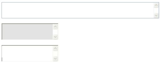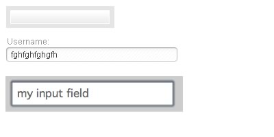
Forms can be a very important part of a website as often are a gateway in the conversion funnel. Web designers are finding very interesting and often subtle ways to make forms less painful and, at times, more appealing. Forms should not be confusing or overly cluttered. Also, it is important that forms have visual appeal to make the process of entering (or sharing) information more graceful and easier. This article will cover some interesting form design options for the input field. This will be less a "how to" than an aesthetic assembly. Below are some unstyled or minimally styled forms. ( Internet Explorer 6 default input form style. )
![]()
Now, below are some examples of Internet Explorer rendered form fields <textarea>, but with some style treatments. For example, changing the background color can a be a simple transformation to a default <textarea> or <input>.
input { background-color: #cccccc; }
Above, the HTML for changing an input field's background color to a light gray.  More styles: There are a number of form elements that you can manipulate to better integrate HTML forms into your overall aesthetic direction. These elements will be a good place to start for designing a web form:
<form> <input> <select> <textarea> <label>
From providing borders to background images and background colors, forms can undergo some quite elegant transformations using beginner and intermediate level CSS. Contemporary Input Field Styles Below are some more contemporary implementations of web form input fields ( and buttons ).
![]()
![]()
The very famous Apple text input field. A small "finder" icon sits to the left of the input area. The graphic simplicity of this design makes many Apple fans feel like their products are more "intuitive." Below the first Apple input field is an activated (selected) field that displays a blue glow effect to demonstrate that this is an interactive object and it is in the process of an action / engagement with the user.
![]()
Google recently underwent a design update that changed the look and feel of it's field input area and search button. There was debate during the design process that the button would contain a deep blue background color to which many Google testers during the "dogfooding" process felt that it was a distraction away from the paid search ads that are Google's bread and butter. This softer and more integrated button became the winning element. This approach involves nesting the button within the search field so as to make the two elements (field and button) appear as one integrated unit. Also such nuances may seem trivial to most users of the web, for Google such decisions can directly impact their bottom line. Google's goal is to reduce the clutter and confusion of a web search and reduce the time it takes for a user to click on a result or ad. This hyper minimalist / efficiency driven approach has made Google millions, and the results of subtle design changes can be tested an segments of users before they roll out the final approach. Yet some have criticized this design process of testing, testing and more testing as lacking innovation and true creativity.


Twitter has been long praised for a sense of interesting and engaging web design. Here it takes a similar approach to encapsulating the button with the input field to make a single form object. The input and trigger (form and button) are simplified into a single action item that feels both cute and friendly, at the same time. Rounded edges help give form items more personality and a sense of ease or comfort--besides just simply being nice to look at.

Above are three other common approaches within contemporary web design for creating a sense of "ease of use" and friendliness. Two of the above examples use background images (background-image: url();) to give a very subtle treatment to the input field. Such approaches can use a repeatable image or one larger image whose edges will not be reaches as they extend beyond the confines of the field (in the background). The third option uses more of a "simple design" approach which has a certain cute factor but also improves usability through clear, easy to read large font and padding between field edge and internal content. Note: the hightlight is caused at the OS level by Apple, but not a product of the form CSS.
Here is the code used to create the (above) third example (of the last three). The CSS in this demo is embedded, but if you were to recycle this CSS for use in other fields with a uniform application, it would be recommended to create a class for the CSS instructions.
<div style="margin: 10px 20px 10px 20px;">
<input style="padding: 5px; font-family: Geneva, Arial, Helvetica, sans-serif; font-size: 16px; color: #666;" />
</div>
by Jonathan Franchell, CEO of Ironpaper - For more tips and hacks: Need to remove a new line after h1 tags? Both web designers and SEO practitioners need to employ headline tags: H1, H2, H3 in several ways to improve web page structure and tag...

The marketing industry is transforming significantly due to generative AI and increasing market complexity. Gartner's prediction of a 25% decline in traditional search traffic suggests that the era of search engines is dying. AI tools, particularly...

The Crowded Arena of the IT Marketplace Updated December 2024 The Information Technology (IT) landscape is experiencing rapid growth and intensifying competition. IT spending is projected to reach nearly 5.1 trillion U.S. dollars in 2024, a...

Marketing healthcare technology presents unique challenges that differ significantly from other industries. The complexity of medical products, the stringent regulatory environment, and the diverse needs of healthcare providers create barriers that...
