
Colleges and universities tout their ability to help graduates compete. But higher education institutions are themselves competing in a densely populated market.
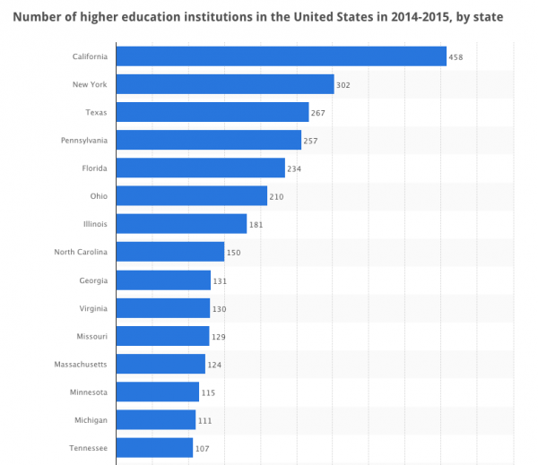
California alone had 458 higher education institutions in 2015. Yet staying abreast of trends for education website design can help a school stand out.
Education sites have several audiences — current students, faculty and staff, prospective students and parents, as well as alumni and potential donors.
Consequently, developers of education sites must create buyer personas specific to several audiences. Although the revenue-generating student is typically the primary focus, it's important to consider other audiences' needs, too.
https://www.ironpaper.com/articles/six-steps-to-better-buyer-personas/
Marketers for higher education should develop websites that attract, educate, convert, and nurture website visitors. And to do so, they must identify a value proposition relevant to the next crop of students.
To inform a value proposition statement, it's important for marketing to truly understand why students select their institution. And they must communicate this messaging with the web developers and copywriters.
Keeping in mind your specific audience and value proposition, the following trends will vital in 2017 education website design.
https://www.ironpaper.com/articles/inbound-marketing-for-higher-education/
Because several audiences look for relevant information on your site, information hierarchy is vital. The design equivalent of "good information organization" is composition.
Good composition guides the eye to the most important bits of information.
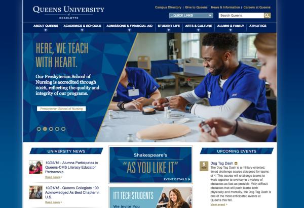
And in this example, a vibrant image of the academic environment is a focal point, yet visitors are also guided to the site’s most important information. This includes focused header menus, blocked text, and additional links.
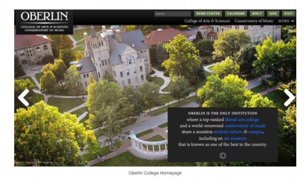
High-resolution photos are a must. Yet designers for education websites can also put an emphasis on clean typography.
But with so much content and hundreds of inside pages, an education website design must consider readability, while also creating content connections and information hierarchies.
Take this example:
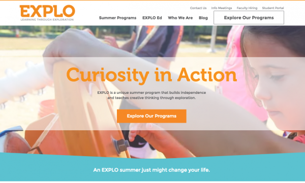 Employing the institution’s color palette effectively in CSS style headers can help create a sense of order. For instance, use different fonts or colors for Headers, Calls to Action, Paragraph Text and Accents. Doing so will provide the user a richer experience.
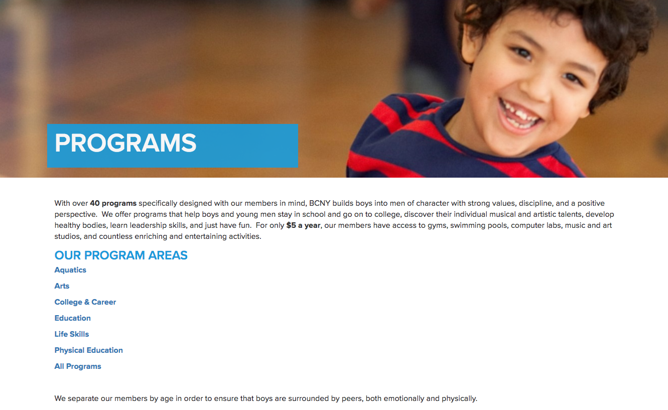
Further, avoid information overload on an education website. With your design, aid navigation and prioritize content. White space is essential:
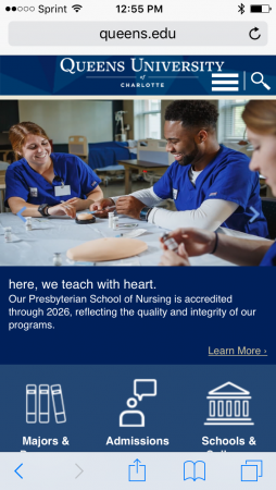
Optimizing for mobile is not even a trend any longer — it’s a necessity. Yet visitors to an educational site typically want in-depth information rather than snippets.
Content composition matters here too. At the same time, consider whether the mobile visitor will prefer to navigate through several focused pages, or scroll down one well-organized one.
The prospective student, too, looks for a deeper experience of the institution even without stepping onto campus. Virtual tours now truly need to be virtual.
Simply posting a bunch of glamour shots of campus is no longer a “virtual tour.” Compared to the virtual reality trend, even interactive maps will have a tough time competing.
Make sure to choose a web hosting platform and/or a marketing partner with flexible technology capabilities.
https://www.ironpaper.com/articles/wordpress-good-choice-education-websites/
Online videos are also a growing expectation. And there are many options to create short, high-quality videos that can make a real impression.
86% of colleges and universities have a presence on YouTube, according to Insivia.
Some simple video content examples include:
By sharing your personality in succinct, well produced videos, you can help tell the educational institutions story in human terms. Additionally, by engaging potential students on a personal level, you can trigger their motivation to act.
Education institutions need to be as ready to learn as their students. It’s all about user experience online today.
Embracing an agile methodology in web design further helps your institution's ability to put its in-demand programs on display. This means that you continually analyze trends, data, and conversions to see what's working.
Since your website carries such a high stake in converting visuals into donors or students, you should be monitoring for performance and optimizing.
Finally, tracking trends in educational website design can help any education marketer continually improve and ensure that they're providing a “wow” factor.
https://www.ironpaper.com/articles/benefits-of-growth-driven-design-over-traditional-web-design/
Patel, H. (2105, November 24). 5 Higher Education Marketing Trends to Watch in 2016. https://ecityinteractive.com/blog/5-higher-education-marketing-trends-to-watch-in-2016/
Roach, N. (2016, July 8). 9 Trends Changing College Website Designs for the Better. https://axelerant.com/trends-changing-college-website-designs-for-the-better-for-education/
Rocheleau, J. (2016, May 12). Modern Web Design Trends for College & University Websites. https://envato.com/blog/modern-design-trends-for-college-universtity-websites/
Insivia. (2016, January). 50 Must-Know Stats About Video Marketing 2016. https://www.insivia.com/50-must-know-stats-about-video-marketing-2016/
by Jonathan Franchell, CEO of Ironpaper - For more tips and hacks: Need to remove a new line after h1 tags? Both web designers and SEO practitioners need to employ headline tags: H1, H2, H3 in several ways to improve web page structure and tag...

The marketing industry is transforming significantly due to generative AI and increasing market complexity. Gartner's prediction of a 25% decline in traditional search traffic suggests that the era of search engines is dying. AI tools, particularly...

The Crowded Arena of the IT Marketplace Updated December 2024 The Information Technology (IT) landscape is experiencing rapid growth and intensifying competition. IT spending is projected to reach nearly 5.1 trillion U.S. dollars in 2024, a...

Marketing healthcare technology presents unique challenges that differ significantly from other industries. The complexity of medical products, the stringent regulatory environment, and the diverse needs of healthcare providers create barriers that...
