
Both landing pages and a strong homepage are necessary for your digital marketing strategy and website presence. But what is the difference between the two? It's a great question and one we can answer in a few different ways.
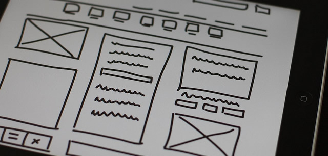
In the landing page vs. homepage debate, landing pages are ultimately meant to drive a lead-conversion for something specific, while a homepage can be considered a launching off point to many different actions.
But let's break it down into more specifics: how targeting keywords, content, setting goals, and determining calls-to-action and design are different for landing pages and a homepage.
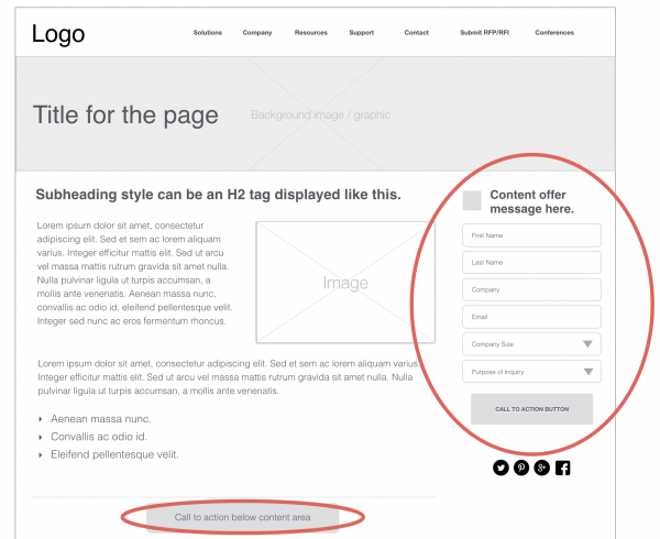
A landing page goal is to immediately convert someone into a lead. That's why landing pages should have conversion forms very visible at the top of the page. You can and should have multiple landing pages so you can continue driving more diverse conversions!
Companies see a 55% increase in leads when increasing their number of landing pages from 10 to 15. - HubSpot
But for a homepage, the goal is to help visitors "choose their own adventure" if you will. You clearly present many options with a homepage, so visitors can choose the relevant option for them. These can be links to explore different features, read unique content pieces, or get in touch. Of course, you want to convert them, but a homepage should meet any buyer in their journey with education if they need it first.
Landing pages often have dedicated content on them to help you rank for one focused keyword or keyphrase. This keyword is usually strategically targeted so you can drive sales-ready leads to your form.
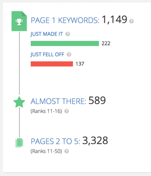 Spyfu is one example of an SEO tool that will help you identify keywords, and then monitor your progress on ranking for them.
Your homepage, however, is a central destination for many internal and external links. So it may rank for several or even many keywords, even though you may choose one keyword focus in particular for your major headers, etc.
Landing page content is in-depth with one topic, while homepage content is more about breadth of many topics that comprise your business. Think about a landing page as exploring one topic or conversion, while the homepage is a catalog of multiple topics and/or features.
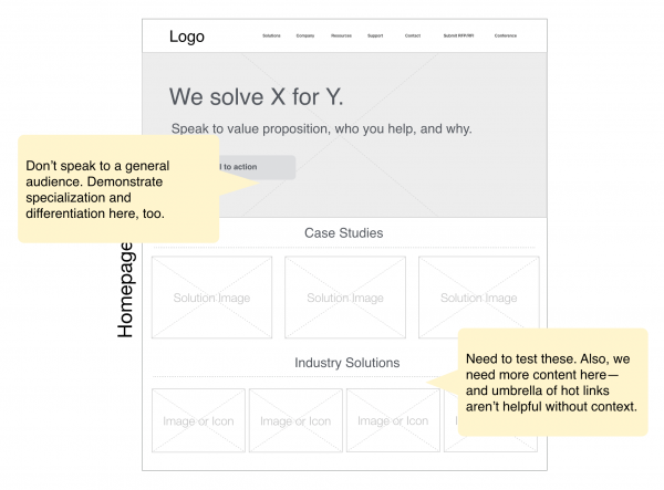
Both a landing page and a homepage should have lots of compelling and targeted content. But the goal of homepage content is mainly to educate and speak to the value and pain points of your leads. Conversely, a landing page sets out to convert someone on a particular offer, like a demo or case study download. So it can be less educational and more sales focused.
Landing pages should have one main call-to-action (CTA), and any other CTAs on the page should ultimately drive that same conversion. This is so you laser focus on the goal conversion.
But a homepage can and should have many CTAs. Primarily there should be CTAs in your navigation and "above the fold" or on the immediately visible part of your content, as well as throughout the page. This is so leads can self-navigate through their buying journey like choosing a route on a map.
You can also use dynamic personalization to make your calls-to-action more relevant to a prospective buyer. Dynamic personalization allows for a wealth of creative options for testing messaging with buyers. For instance, you could test messaging related to a buyer's role at an organization or simply test content offers.
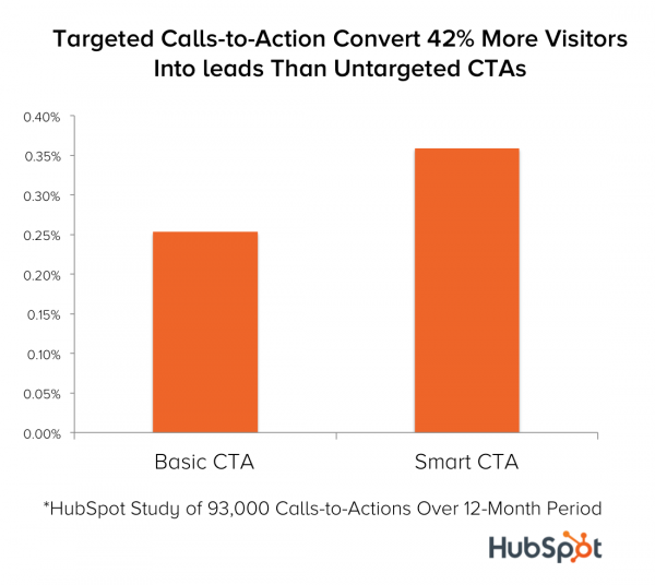 Personalized calls-to-action can increase conversions on your blog content, moving readers through the sales funnel.
Design-wise, landing pages stick to a pretty easily recognizable design template. You should have some explanatory content, an image or sample of the conversion point (like an eBook cover or a demo teaser video), and a form at the top. Usually these fall in a two-column design. Sometimes a landing page can act like a "pop up" or a top layer on your homepage. This design is OK as long as you give visitors an opt-out option to explore the rest of your website instead.
For a homepage, you are unlimited in your creativity and can try different modules and web designs to get your message across. Just make sure you always have a clear value proposition immediately, and that you have enough content spots on the page to allow your homepage to be "crawled" in search.
The major difference between a landing page and a homepage is the goal: Landing pages drive one main conversion, while a homepage is a map through your website to encourage leads to self-guide their buying journey.
However, you should pay attention to strategic differences in content writing, keyword targeting, design, and calls-to-action in order to get the best results from every page on your website!
Sources
HubSpot, August 2017 (updated), “Why You (Yes, You) Need to Create More Landing Pages” article
by Jonathan Franchell, CEO of Ironpaper - For more tips and hacks: Need to remove a new line after h1 tags? Both web designers and SEO practitioners need to employ headline tags: H1, H2, H3 in several ways to improve web page structure and tag...

The Crowded Arena of the IT Marketplace Updated December 2024 The Information Technology (IT) landscape is experiencing rapid growth and intensifying competition. IT spending is projected to reach nearly 5.1 trillion U.S. dollars in 2024, a...

Updated December, 2024 The field of digital marketing is evolving rapidly in response to new technology and changing buyer expectations. To help career-minded marketers, we’ve rounded up the top 10 skills needed to succeed in the field. These are...

The marketing industry is transforming significantly due to generative AI and increasing market complexity. Gartner's prediction of a 25% decline in traditional search traffic suggests that the era of search engines is dying. AI tools, particularly...
