 As a nonprofit, your website is critical to your organization’s long-term success. A strong online presence can help you:
Given that, your nonprofit website design needs to be designed with those unique objectives in mind, so visitors – including donors, potential partners, and the media – are inspired to take action and get involved.
Here are the four best practices for designing a nonprofit website that engages donors, builds relationships with potential advocates and volunteers, and broadens your organization’s reach.
Prospects may find your site through organic search, referral links, or social media, but they may not be familiar with your nonprofit initially. Therefore, you need to clearly communicate your mission statement and value proposition throughout the website.
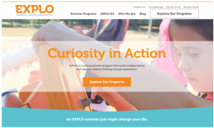
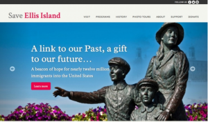
 Your value proposition should be immediately clear, "above the fold" of your home page.
A value proposition speaks to your target audience and explains why they should donate to your cause specifically. This should be a very clear statement highlighting the impact of a donation, advocacy action, or volunteer opportunity.
“55% of visitors spend 15 seconds or less on your website.” – Hubspot
Therefore, your value proposition must be conveyed in under that time limit. When writing content and designing the homepage, place your value proposition clearly above the fold. You can then run user testing to see if the value is clear to users immediately.
As donations are a crucial part of your nonprofit’s success, your website needs to be optimized to inspire people to support your cause. To that end, we recommend placing an attractive, eye-catching donation button on every website page and making the actual donation process as painless as possible.
“65% of nonprofits require three clicks or more to make a donation” – bbcon
Yet an experience that takes too many clicks, time, or frustration will turn away donors.
 While this rate of form fields vs. conversion rate can vary for your organization, try to keep a balance between # of fields and the perceived value of the conversion.
So, for example, don’t request excess information on the donation web page – just collect the donor’s name and credit card number to begin.
Later on you can gather additional personal details with progressive profiling: Asking more questions as you reconvert donors into advocates by offering interesting content offers and advocacy opportunities. For example, you could send first-time donors an impact infographic to download if they answer a few more questions about why they donated.
We also recommend encouraging monthly giving by outlining exactly what the donations will accomplish.
63% of donors want to know how money will be used.
So, for example, create an interactive gamification that demonstrates the impact of giving. For example, design a slider that shows a gift of $15 per month buys a year’s worth of clothing for 100 underprivileged children, while $25 provides medical care for those same children.
We strongly recommend embracing a content strategy and posting blogs, articles, and company news on your nonprofit’s website. However, instead of just posting content for anyone, create content that targets a buyer persona (or your company’s likely donor). What do they want to read? What would appeal to that group?
“Using marketing personas made websites 2-5 times more effective and easier to use by targeted users.” – HubSpot
As you design your website to mobilize your audience, consider relevancy to a visitor's specific segment, interests, or traits. For example, first-time donors and recurring, high-level donors will be attracted by different calls-to-action — "First-time donors: Now double your impact!" versus "Give the gift of hope again." Both are infinitely more compelling than "Donate," however, only if you present the right message to the right viewer.
So consider investing in marketing automation tools like HubSpot that allow for smart content. Or, at least, pay heed to which pages attract which segments, and place relevant calls-to-action.
A strong call to action (or call to donate, volunteer, etc.) is incredibly important for nonprofit websites.
90% of visitors who read your headline also read your CTA copy.
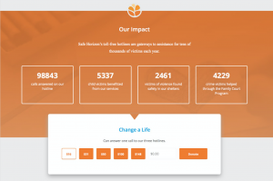
 This call-to-action for one nonprofit is gamified, so visitors can see the potential real-world impacts of their donations.
Each page should have a CTA, but they must be relevant. So if a visitor is reading an article about the benefits of volunteering, the CTA should not ask them to donate; instead, the CTA should encourage them to volunteer their time.
The language and placement of the CTA is crucial. You can test different locations of the CTA to find out where users are more likely to click.
For example:
Even if you don’t have a full-time designer, following these four best practices will help improve your nonprofit website, gaining more visitors and potential givers.
https://www.ironpaper.com/articles/nonprofit-content-marketing/
https://blog.hubspot.com/marketing/chartbeat-website-engagement-data-nj#sm.00000045s3peuzcsqx48tudd2v2ot
https://www.slideshare.net/smaclaughlin/50-fascinating-nonprofit-statistics
https://unbounce.com/landing-pages/threats-to-your-conversion-rate/
https://blog.hubspot.com/marketing/build-buyer-personas#sm.00000045s3peuzcsqx48tudd2v2ot
by Jonathan Franchell, CEO of Ironpaper - For more tips and hacks: Need to remove a new line after h1 tags? Both web designers and SEO practitioners need to employ headline tags: H1, H2, H3 in several ways to improve web page structure and tag...

The Crowded Arena of the IT Marketplace Updated December 2024 The Information Technology (IT) landscape is experiencing rapid growth and intensifying competition. IT spending is projected to reach nearly 5.1 trillion U.S. dollars in 2024, a...

Updated December, 2024 The field of digital marketing is evolving rapidly in response to new technology and changing buyer expectations. To help career-minded marketers, we’ve rounded up the top 10 skills needed to succeed in the field. These are...

The marketing industry is transforming significantly due to generative AI and increasing market complexity. Gartner's prediction of a 25% decline in traditional search traffic suggests that the era of search engines is dying. AI tools, particularly...
