 Websites & email marketing must be designed for mobile
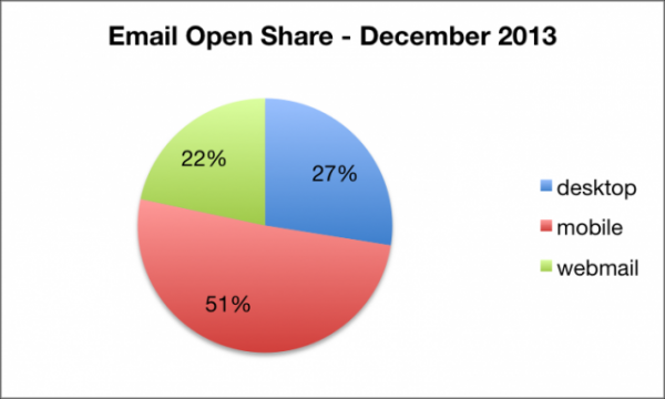
A report by Return Path on December 31, 2013 highlights the importance of mobile for email marketing. Over the 2013 holiday season, 51% of all emails were opened on a mobile device. Desktop had a mere 27% of email opens.
Mobile responsive web design is becoming more and more critical to businesses. For businesses that use email marketing as a central channel for their campaigns, mobile websites cannot be forgotten.
This fact may be increasingly true for ecommerce websites. Email plays an important role in eCommerce. From cart abandonment offers to account updates, email must be a fluid extension of any eCommerce website. According to a report by eDigitalResearch and IMRG, 77% of eCommerce shoppers abandoned their shopping carts in 2013. Yet, more than an eighth (13.3%) of shopping cart abandonment emails are clicked and nearly 50% are opened. About a third of these emails lead back to a sale on the website. Considering that 50% of emails in the Return Path study are opened on a mobile device (and 62% on Christmas), the coupling of mobile responsive web design with email marketing should be part and parcel.
Email is also the fourth largest content sharing platform--just below Facebook, Twitter and Pinterest, according to a 2014 study by Sharethis. This study by Sharethis may under count the performance of email in favor of social platforms as well.
When users click from email content on mobile devices and receive a desktop-only web experience, their user-experience is impeded. They go from reading a clear, concise message on their mobile phones to having to pinch, swipe, scroll and scan for next steps on a website. This can cause excessive drop-off.
For SEO, mobile optimized websites are becoming increasingly important. Google rates and judges websites based on load-time performance for mobile specifically. New features in Google Webmaster Tools help web developers and website owners track load-time issues for both desktop and mobile.
Additionally, Google is overhauling their Googlebot for mobile. A new Googlebot will be released shortly and seek out mobile responsive websites to improve content results for mobile searches.
As a best-practice, emails and websites should be optimized for desktop, tablet and mobile. Email marketing offers and communications should be paired with like-message landing pages that play well with the device accessing it. Optimization for mobile must factor in calls-to-action, design, messaging and user behavior to drive increased performance for campaigns. Although this may complicate marketing, it makes communications more relevant to prospects, subscribers, fans, leads and customers.

SOURCE:
by Jonathan Franchell, CEO of Ironpaper - For more tips and hacks: Need to remove a new line after h1 tags? Both web designers and SEO practitioners need to employ headline tags: H1, H2, H3 in several ways to improve web page structure and tag...

The Crowded Arena of the IT Marketplace Updated December 2024 The Information Technology (IT) landscape is experiencing rapid growth and intensifying competition. IT spending is projected to reach nearly 5.1 trillion U.S. dollars in 2024, a...

Updated December, 2024 The field of digital marketing is evolving rapidly in response to new technology and changing buyer expectations. To help career-minded marketers, we’ve rounded up the top 10 skills needed to succeed in the field. These are...

The marketing industry is transforming significantly due to generative AI and increasing market complexity. Gartner's prediction of a 25% decline in traditional search traffic suggests that the era of search engines is dying. AI tools, particularly...
